Website Design
Beautiful Design.
Without researching your client, we believe this can’t be achieved effectively. When designing a website, we consult with you about goals and objectives and also look at analytics, to see exactly where you’re customers are coming from and their browsing habits while on your site. From this we can see where your last website was letting you down and not converting visitors into customers.Although this gives us a deeper understanding into you and your customers, we’re also a creative bunch working with some great, well established clients. We’re always up to date with the latest trends and methods and have a track record of providing sites that deliver.
User Experience.
Visitors browsing a website usually have to be guided through the website to reach the area that you want them to visit. This then means it’s vital when converting visitors to customers via the use of sign-ups, registrations or a purchase.If a website is designed in such a way that the user expects things to be in the position they are in, links react like the visitor would expect and the page flows how they’d like, you’ll have a happy visitor and one that is more likely to browse your site in detail. This User Experience will keep your visitors engaged and whilst this is difficult to achieve, the benefits for you and your customers are worth it.
Development.
To match our design skills, we have a strong background in back-end development. We are geeks at heart and proud! If were not at work helping our great clients, you’ll find us playing with the latest HTML5 goodies and creating completely unnecessary but amazing animations!We can integrate a variety of Content Management Systems (CMS) with your site along with rock solid, database driven customer access areas and registration systems. To match our design skills, we have a strong background in back-end development. We are geeks at heart and proud!
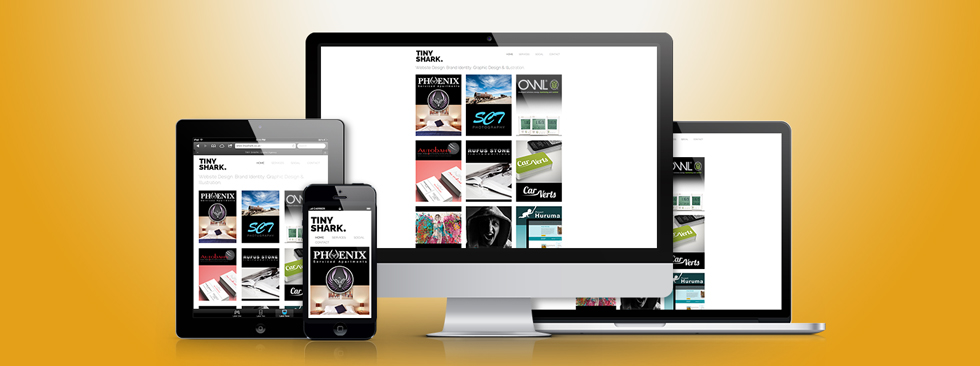
Responsive Design.
Tiny Shark offer fully responsive layouts when creating websites. This means that your website is designed with all devices in mind and is able to change depending on what device it is being viewed on. Using CSS we can take away content that is simply not needed when browsing on a phone or add a touch friendly menu, for example. This method is much better for Search Engine Optimisation (SEO) and Google now officially state this is the best method.In a mobile world that we live in, it is vital that your content looks great on all devices. Mobile browsing accounts for approximately 20% of the total internet traffic per year. That means that without a mobile friendly website, you could be excluding 20% of your potential customers.
